
Data visualization using pandas:
We get more insight and details when we see a pictorial or graphical information than the numerical data in a table. Data visualization is important in most of the fields to compare and analyze large data sets. Pandas provides this option to view the data using various libraries. let us explore those in this section.
Introduction
Pandas is a popular data manipulation and analysis library in Python, and it provides various functions for data visualization. While Pandas itself does not have built-in plotting capabilities, it is tightly integrated with the Matplotlib library, which is a powerful and widely used plotting library in Python. Additionally, Pandas also provides some basic plotting functions that make it easy to create simple visualizations directly from DataFrames.
Here are some common techniques for data visualization in Pandas:
Basic Pandas Plots:
- Pandas has a few built-in functions for basic plotting that are built on top of Matplotlib. You can use the
plot()method on a Pandas DataFrame or Series to create simple line plots, bar plots, histograms, scatter plots, etc. For example:import pandas as pd import matplotlib.pyplot as plt # Create a DataFrame data = {'A': [1, 2, 3, 4], 'B': [5, 6, 7, 8]} df = pd.DataFrame(data) # Line plot df.plot(x='A', y='B', kind='line') plt.show()The output of the above code is shown: Line plot Matplotlib Integration:
You can use Matplotlib directly with Pandas data structures to create more customized and complex visualizations. Pandas DataFrames and Series can be used as input to Matplotlib functions. For example:
import pandas as pd
import matplotlib.pyplot as plt

# Create a DataFrame
data = {'A': [1, 2, 3, 4], 'B': [5, 6, 7, 8]}
df = pd.DataFrame(data)

# Scatter plot using Matplotlib with Pandas DataFrame
plt.scatter(df['A'], df['B'])
plt.xlabel('A')
plt.ylabel('B')
plt.title('Scatter Plot')
plt.show()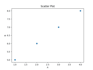
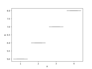
Seaborn is another data visualization library in Python that works well with Pandas. It provides a high-level interface for drawing attractive and informative statistical graphics. You can use Seaborn functions directly with Pandas DataFrames. For example
import pandas as pd
import seaborn as sns
import matplotlib.pyplot as plt

# Create a DataFrame
data = {'A': [1, 2, 3, 4], 'B': [5, 6, 7, 8]}
df = pd.DataFrame(data)

# Box plot using Seaborn with Pandas DataFrame
sns.boxplot(x='A', y='B', data=df)
plt.show()
The output of the above code is shown: Box plot
Plotting with Categorical Data:
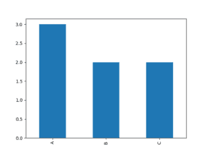
Pandas also provides functions for plotting categorical data. For instance, you can use the value_counts() method to get the counts of unique values and then plot them. Example:
import pandas as pd
import matplotlib.pyplot as plt

# Create a DataFrame with categorical data
data = {'Category': ['A', 'B', 'A', 'C', 'B', 'A', 'C']}
df = pd.DataFrame(data)

# Bar plot of categorical data
df['Category'].value_counts().plot(kind='bar')
plt.show()
The output of the above code is shown: Bar Graph
These are just a few examples, and there are many other plotting options and customization possibilities available with Pandas and the libraries it integrates with. Visualization is an essential part of data analysis, helping to gain insights and communicate findings effectively.
please find the codes in jupyter notebook embedded here, read full file using scroll bar to the right-side, you can go through these and practice it.